Hayleigh Simpkins
Hayleigh Simpkins is a recent CAP graduate specialising in graphic art and design, as well textiles.
From her website:
"My practice is influenced by the Japanese aesthetic of ‘wabi-sabi’. ‘Wabi’ vaguely meaning the realisation of beauty in simplicity, and ‘sabi’ being the bleak quality of ageing and deterioration. The sense of authenticity brought about by chance encounters from everyday life is an important element of my current work, which through an exploration of lettering, typography, language, dada and postmodern theory, plays with conventional ‘rules’ of legibility to raise questions about the difference between reading and seeing text. Although I work mainly in the Graphic tradition, it is made using a variety of techniques and materials. I am particularly interested in employing low tech processes to make work with a sense of the ephemeral - despite graphic design being perceived as a precise discipline."
As she states, Hayleigh explores the true nature of legibility through experimental typography, lettering and collage, and through her artwork allows us to explore the beauty simple letter forms can possess when contextualised as a purely visual aesthetic, outside the realm of basic reading purposes.
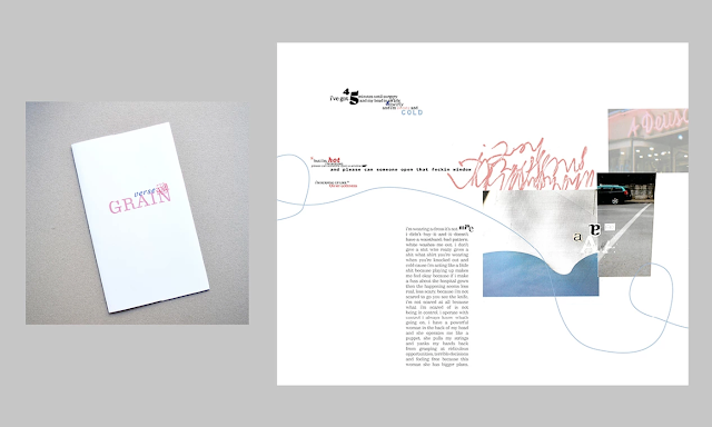
Her collaborative book 'Verse & Grain' really emphasises the drive behind her artist's statement (pictured above from her website). Hayleigh describes her approach to type as 'unconventional', and through her elegantly minimalistic scrawls accompanying scattered clusters of text, she really draws attention to the playfulness of words and how they can be utilised in exciting ways on the page, pushed into fruition through a collage-style layout and whimsical lines flourishing across the blank space as a finishing touch.
I have always loved any graphic work that incorporates lettering alongside visually playful collage, and what Hayleigh has managed to do is combine the two seamlessly.

This poster again encapsulates Hayleigh's refined way of creating a powerfully graphic image that doesn't rely on precise detail, yet the visual aesthetic she produces retains that intricacy.
The idea of lettering or typography combining with collage is also appealing in terms of my own project. Looking into foreign words that don't have an English equivalent, this technique of layering and playful composition would be a great visual representation of the complexity of some of these 'untranslatable words'.


Comments
Post a Comment